Since our system has now been balanced, we will be able to display our results - e.g. flow direction arrows can be drawn, and pressure heads at nodes can be displayed, according to a colour legend.
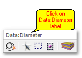
In order to change the display theme, click on the Data:Diameters label.

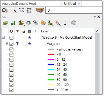
A list of themes will be shown, from which we will select Analysis:Demand Head.
The GIS Layer Manager has changed to reflect the new display settings (with the theme in accordance with their pressure heads):

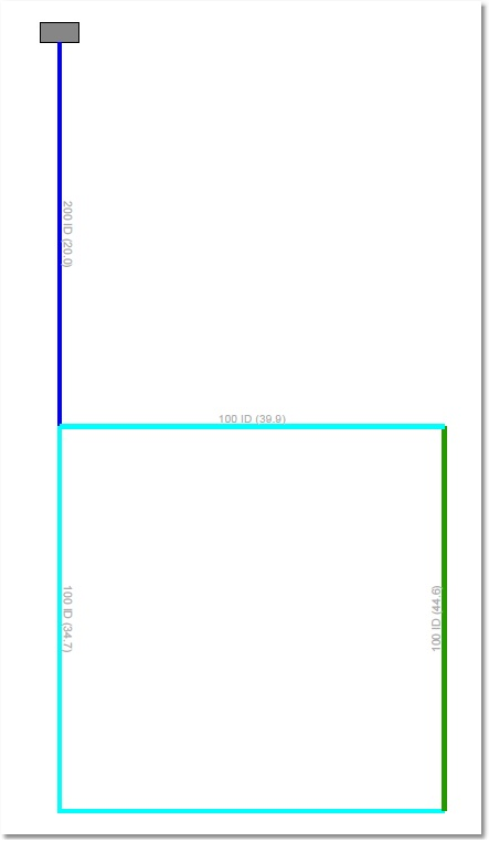
The model display will look as follows (after increasing line-widths slightly to improve clarity of pipe colours):

The links shown in light blue have Average Head values between 24 m and 40 m. The links shown in dark green have Average Head values between 40 m and 60 m. Note, there are no problematic links with Average Head values lower than 12 m (i.e. no links shown in red or pink).