A pressure versus cost graph of the optimum and Pareto Optimal solutions can be viewed (in the Graph Editor) by using the Analysis > Optimization > Optimization Graph menu option (from the Main Menu). This graph has cost on the X-axis, pressure on the Y-axis, and plots the following:
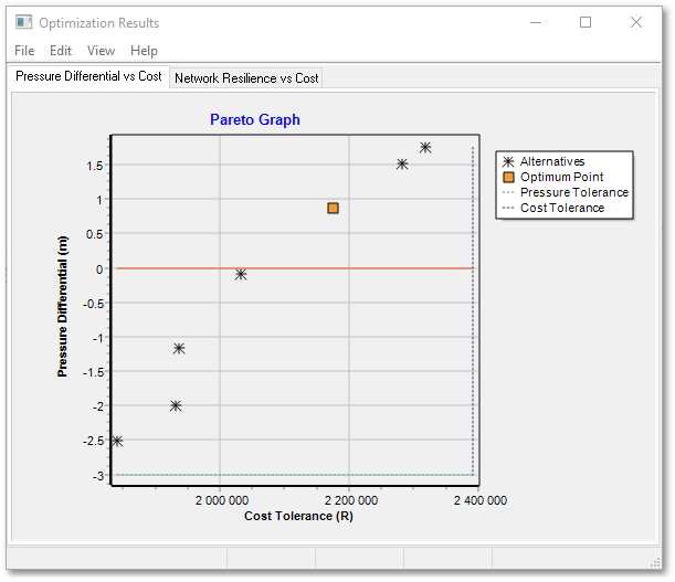
•The cost and minimum pressure for the optimum solution.
•The cost and minimum pressure for all Pareto Optimal solutions.
•A vertical line perpendicular to the X-axis, which represents the maximum cost allowed in accordance with the Pareto Optimal cost tolerance.
•A horizontal line crossing the Y-axis, which represents the minimum pressure allowed in accordance with the Pareto Optimal pressure tolerance.
Careful inspection of this graph can give an indication as to which of the Pareto Optimal solutions will be the most appropriate.
First, all solutions will plot to the left of the vertical Pareto Cost Line, and above the horizontal Pareto pressure line.
Secondly, all the plotted points will have no other point plotted in its upper left quadrant, meaning that there is no cheaper solution which provides better pressure. Hence, these are all termed non-inferior or Pareto Optimal solutions.
Thirdly, the user can look for the following qualities in the imaginary line which connects all the solutions:
•To the right of the optimum solution, one should look for a steep incline, meaning that for little extra expense a lot of pressure is gained. The solution which plots at the top of such an incline is a good candidate.
•To the left of the optimum solution, one should look for a flat gradient, meaning that for much less expense, only minimal pressure is lost. The solution which plots at the left of such a flat gradient, is a good candidate.